
Parent Orbit Setup
Overview
The Parent Orbit Setup program allows schools to customise their Parent Orbit app homepage. From here, app administrators can manage the layout of the Parent Orbit app's homepage, set the order of the tiles, enable or disable tiles, arrange screen elements, customise icons and links, and adjust the app’s colour scheme for a personalised experience that reflects the school's branding.
The customisation features are split into the following tabs:
User Security Permissions
To access this program, users must have the 'Orbit' menu and 'Parent Orbit Setup' permission points enabled in TASS.web System Admin > Users > User Maintenance or Security Role Permissions.
This program manages the colours, icons, and elements that make up the Parent Orbit Homepage.
The banner and sliding images on the Parent Orbit app homepage are managed in TASS.web System Admin > Utilities > Product UI Maintenance for ‘Parent Orbit'.
The sliding image frame rate can be customised by adjusting the ‘Frame Rate’ field in TASS.web Student Admin > Parent Records > Setup Information > Parent Lounge Setup.
The Parent Orbit app user interface colours and default icon settings can be managed in TASS.web System Admin > Utilities > API Gateway Maintenance on the ‘OAuth2 API Applications’ tab via the ‘Metadata’ link in the Action column.
The School Logo can be added in TASS.web System Admin > Utilities > API Gateway Maintenance on the ‘OAuth2 API Applications’ via the ‘Edit’ link in the Action column.
The Parent Orbit Extra Curricular Hub icons are set up in TASS.web Student Admin > Extra Curricular > Setup Information > Extra Curricular Setup on the 'Activity Types' tab.
Homepage Setup
The 'Homepage Setup' tab manages the appearance of elements on the app's homepage, including the school name, the number of tiles in each row, and the image height and sort order.
Fields that require further explanation | |||||||||||
Hide School Name in Top Text | Select this checkbox to hide the school name on the Parent Orbit homepage. When this option is selected, the school name will still appear in the Side Menu. | ||||||||||
* Tiles Per Row on Homepage | Use the drop-down list to select the number of tiles per row to display on the Parent Orbit homepage. You can choose to display 2, 3 or 4 tiles per row. | ||||||||||
* Homepage Image Height | Use this field to set the image height on the Parent Orbit homepage. The screen height percentage must be between 10% and 80%. | ||||||||||
Elements Grid | The elements grid summarises the Parent Orbit homepage elements (or features) that are enabled (Y) or disabled (N), along with the element name and sort order. Click column headings to sort rows ascending or descending. Drag column headings to reorder columns. The following elements can be customised:
Click the ‘View’ icon in the Action column to see more details about each element, or click the ‘Edit’ icon to make changes. When editing an element:
| ||||||||||
Homepage Tiles
The 'Homepage Tiles' tab allows users to choose the tiles shown on the app homepage and customise the tile icons, labels, type, target, and sort order.
Homepage Tiles Grid
The ‘Homepage Tiles Grid’ summarises the tiles that can be customised on the Parent Orbit mobile app homepage.
Click column headings to sort rows ascending or descending. Drag column headings to reorder columns.
Column | Description | ||||||
Enabled | This column indicates whether a tile is enabled on the Parent Orbit app homepage. 'Y' means it is enabled, while 'N’ indicates the homepage tile is not enabled. This field indicates whether the tiles are visible on the Parent Orbit app homepage; it does not activate the feature or control user access. To enable app features for your school, activate the API endpoint in TASS.web System Admin > Utilities > API Gateway Maintenance under the ‘OAuth2 API Applications’ tab. Select ‘Edit’ in the Action column for ‘ORBITPARENT’, select the required ‘OAuth Scope - API Access’ checkboxes, then ‘Update'. The security permissions for Parent Lounge control parent access to features in the Parent Orbit app. Permissions can be activated or deactivated in TASS.web System Admin > Users > Portal Security Permissions. | ||||||
Tile Label | This column shows the label displayed on the tile within the Parent Orbit app. | ||||||
Type | This column shows the type of target that the tile displays. | ||||||
Value | This column shows the Target Value selected in the Target field. | ||||||
Icon | Click the ‘Attachment’ icon to download the icon image. | ||||||
Sort Order | This column shows the Sort Order of the tile and the order in which it appears on the Parent Orbit Homepage. | ||||||
Actions |
|


Adding a New Homepage Tile
Click the ‘+Add Tile’ button to create a new Homepage Tile for the Parent Orbit app homepage.
Fields that require further explanation | |||||||||
Enabled | Select this checkbox to enable the tile, making it visible on the Parent Orbit app homepage. Untick this checkbox to disable the tile, hiding it from view. | ||||||||
* Tile Label | Enter a tile label. This label will be displayed beneath the tile icon in the Parent Orbit app. | ||||||||
* Type * Target | Select the type of target, and the target that the tile will open/display.
| ||||||||
* Icon Type | Use this field to specify the type of icon for the tile. Select a ‘Default Icon’ or upload a ‘Custom Icon’ image. Example An example of the default icons that are available in this program. 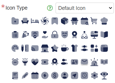 When using a ‘Custom Icon’, the image size should be 100px x 100px, and the file types can be .gif, .png, or .svg. | ||||||||
* Sort Order | Use the Sort Order field to specify the order in which the tile will appear on the Parent Orbit app homepage. | ||||||||
Click ‘Save’ to save the new Homepage tile.
Colour Customisation
The 'Colour Customisation' tab allows users to adjust the colours on the Parent Orbit app homepage using HEX codes.
The default HEX codes on this tab are derived from the default colours specified for the API in TASS.web System Admin > Utilities > API Gateway Maintenance on the ‘OAuth2 API Applications’ tab via the ‘Metadata’ link in the Action column.
Fields that require further explanation | |||||||
* Accent Colour | Enter the HEX code that you want to use as an accent colour. This colour will be applied to the top banner and buttons. | ||||||
* Highlight Colour | Enter the HEX code that you want to use as a highlight colour. This colour will be used for the badge counter colour on the tiles. | ||||||
* Icon Colour | Enter the HEX code for the primary icon colour you want to use. This colour will be used for the icons and daily digest buttons. This colour acts as the darker shade when the ‘Two Tone Colour: Secondary Colour’ mode is chosen in the ‘Icon Colour Customisation' field. | ||||||
Icon Secondary Colour | Enter the HEX code for the secondary icon colour. This field is optional, as it is used to select the secondary colour when ‘Two Tone Colour’ mode is selected in the ‘Icon Colour Customisation' field. | ||||||
Tile Font Colour | Enter the HEX code that you want to use for the tile/icon label text. | ||||||
* Icon Colour Customisation | Choose the icon colour style. This colour style will be applied to the icons. Options include:
| ||||||
Click ‘Save’ when complete.
Integration Customisation
The 'Integration Customisation' tab allows icons to be customised for each Notifications API (API30) that schools have enabled in TASS.web System Admin > Utilities > API Gateway Maintenance on the 'TASS APIs' tab.
The Integration Customisation Grid summarises the Homepage settings for each Notifications API.
Click and drag the column headings to change the column sort order.
Column | Description | ||||
App Code | This column displays the Application Code from TASS.web System Admin > Utilities > API Gateway Maintenance on the 'TASS APIs' tab. | ||||
Description | This column shows the API Description from TASS.web System Admin > Utilities > API Gateway Maintenance on the 'TASS APIs' tab. | ||||
Icon | Click the ‘Attachment’ icon to download the icon image. If there isn't an icon, it means an icon has not been set up for the API. Click the ‘Edit’ icon in the Action column to upload an icon. | ||||
Sort Order | This column shows the Sort Order of the tile and the order it appears on the Parent Orbit Homepage. | ||||
Actions |
|
Third Party OAuth
The ‘Third Party OAuth’ tab allows schools to set up and oversee third-party integrations, such as Schoolbox. From here, users can view, add, edit, delete, disable, and enable third-party integration connections to the Parent Orbit app.
Example
The Schoolbox Integration lets schools configure Schoolbox logins within the Parent Orbit app. It enables parents to link their TASS Parent Orbit accounts to Schoolbox for seamless in-app integration. The initial release focuses on a calendar module that displays Schoolbox timetables and school events alongside existing Orbit data. This offers parents a unified view of their child's schedule.
Third Party OAuth Grid
The ‘Third Party OAuth Grid’ summarises the third-party applications that your school has configured for the Parent Orbit app.
Column | Desciption | ||||||
|---|---|---|---|---|---|---|---|
Integration | The ‘Integration’ column displays the Integration Type selected during setup. | ||||||
Status | The ‘Status’ column displays ‘Enabled’ if the integration is enabled, or ‘Disabled’ if it is not. | ||||||
Actions |
|


Adding a New Third Party OAuth Integration
Click the ‘+ Add New’ button to create a new Third Party OAuth Integration for the Parent Orbit app.
Field Label | Description |
|---|---|
Enabled | Select the ‘Enabled’ checkbox to activate the integration or clear it to disable it. |
* Integration Type | Select your integration type. Currently, the only option is 'Schoolbox'. |
* Base URL | In the ‘Base URL’ field, enter the base URL for your integration. |
* OAuth Client ID | In the ‘OAuth Client ID’ field, enter the base URL for your integration. |
OAuth Client Secret | In the ‘OAuth Client Secret’ field, enter the client secret for your integration, or leave it blank to keep the existing secret. |
Scopes | Use the checkboxes in the ‘Scopes’ section to select the scopes that you want to enable for this integration. |
Click ‘Save’ to save the Third Party OAuth Integration details.