
Student Orbit Setup
Overview
The ‘Student Orbit Setup’ program lets schools customise their Student Orbit mobile app homepage, including managing layout, tile order, enabling or disabling tiles, arranging elements, customising icons and links, and adjusting the colour scheme for a personalised, branded experience. It is also where schools can configure whether access to the Student Orbit app should be restricted during school hours.
Coming Soon!
The Student Orbit app is still under development. Refer to the 'Student Orbit App' page on the TASS website for details, or contact TASS Licencing to enquire about getting Student Orbit for your school.
These customisation features are available on the following tabs:
User Security Permissions
To access this program, users must have the 'Orbit' menu and 'Student Orbit Setup' permission points enabled in TASS.web System Admin > Users > User Maintenance or Security Role Permissions.
The ‘Student Orbit Setup’ program manages the colours, icons, and elements that make up the Student Orbit mobile app homepage.
The default app interface and icon colours are derived from TASS.web System Admin > Utilities > API Gateway Maintenance on the ‘OAuth2 API Applications’ tab via the ‘Metadata’ link in the Action column.
The school logo can be added in TASS.web System Admin > Utilities > API Gateway Maintenance on the ‘OAuth2 API Applications’ via the ‘Edit’ link in the Action column.
The banner and slider images set on the ‘Homepage Images’ tab of this program are also visible and can be configured in TASS.web System Admin > Utilities > Product UI Maintenance for ‘Student Orbit'.
The ‘Extra Curricular Hub’ icons are set up in TASS.web Student Admin > Extra Curricular > Setup Information > Extra Curricular Setup on the 'Activity Types' tab.
You can also customise the School Links display in the Side Menu by selecting the ‘Student Orbit Side Menu’ checkbox in Staff Kiosk Links > School Links (Maintain).
Homepage Setup Tab
The 'Homepage Setup' tab lets users customise the app's homepage layout, including the display of the School Name, number of tiles per row, the homepage image height, and the arrangement and sorting of elements.
Fields that require further explanation | |||||||||||||
Hide School Name in Top Text | Select this checkbox to hide the school name on the Student Orbit mobile app homepage. When this option is selected, the school name will still appear in the Side Menu. | ||||||||||||
* Tiles Per Row on Homepage | Use the drop-down list to select the number of tiles per row to display on the Student Orbit mobile app homepage. You can choose to display 2, 3 or 4 tiles per row. | ||||||||||||
* Homepage Image Height | Use this field to set the height of images on the Student Orbit mobile app homepage. The screen height percentage must be between 10% and 80%. | ||||||||||||
Elements Grid | The elements grid summarises the elements (or features) enabled (Y) or disabled (N) in the Student Orbit mobile app, along with their names and sort order. Click column headings to sort rows ascending or descending. Drag column headings to reorder columns. The following elements can be customised:
Click the ‘View’ icon in the Action column to see more details about each element, or click the ‘Edit’ icon to make changes. When editing an element:
| ||||||||||||
Homepage Tiles Tab
The 'Homepage Tiles' tab lets users personalise the tiles on the Student Orbit mobile app's homepage with customisable labels, icons, and sort order.
When 'School Link' is selected as the 'Type', the 'Target' list populates with enabled School Links for Student Orbit. If 'Link Category' is chosen, the 'Target' list shows available School Link Categories for Student Orbit.
Homepage Tiles Grid
The ‘Homepage Tiles Grid’ summarises the tiles that can be customised on the Student Orbit mobile app homepage.
Click column headings to sort rows ascending or descending. Drag column headings to reorder columns.
Column | Description | ||||||
Enabled | This column indicates whether a tile is enabled on the Student Orbit mobile app homepage. 'Y' means it is enabled, while 'N’ indicates the homepage tile is not enabled. This field indicates whether the tiles are visible on the Student Orbit mobile app homepage; it does not activate the feature or control user access. To enable app features for your school, activate the API endpoint in TASS.web System Admin > Utilities > API Gateway Maintenance under the ‘OAuth2 API Applications’ tab. Select ‘Edit’ in the Action column for ‘ORBITSTUDENT’, select the required ‘OAuth Scope - API Access’ checkboxes, then ‘Update'. The security permissions for Student Cafe control student access to features in the Student Orbit mobile app. Permissions can be activated or deactivated in TASS.web System Admin > Users > Portal Security Permissions. | ||||||
Tile Label | This column shows the label displayed on the tile within the Student Orbit mobile app homepage | ||||||
Type | This column shows the Target Type the tile leads to. | ||||||
Value | This column shows the Target Value selected in the Target field. | ||||||
Icon | Click the ‘Attachment’ icon to download the icon image. | ||||||
Sort Order | This column shows the Sort Order of the tile and the order in which it appears on the Student Orbit mobile app homepage. | ||||||
Actions |
|


Adding a New Homepage Tile
Click the ‘+Add Tile’ button to create a new Homepage Tile for the Student Orbit mobile app homepage.
Fields that require further explanation | |||||||
Enabled | Select this checkbox to enable the tile and make it visible on the Student Orbit mobile app. Untick this checkbox to disable the tile and hide it from view. | ||||||
* Tile Label | Enter a tile label. This label will be displayed beneath the tile icon in the Student Orbit mobile app. | ||||||
* Type * Target | Select the type of target, and the target that the tile will open/display.
| ||||||
* Icon Type | Use this field to specify the tile's icon type. You can select a ‘Default Icon’ or upload a ‘Custom Icon’ image. Example An example of the default icons that are available in this program. 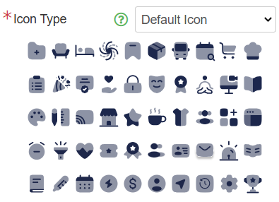 When using a ‘Custom Icon’, the image size should be 100px x 100px, and the file types can be .gif, .png, or .svg. | ||||||
* Sort Order | Use the Sort Order field to specify the order in which the tile will appear on the Student Orbit mobile app homepage. | ||||||
Click ‘Save’ to save the new homepage tile.
Homepage Images Tab
The 'Homepage Images' tab enables users to easily customise the homepage banner and slider images, background colour, and top text colour.
Homepage Images Grid
The ‘Homepage Images Grid’ summarises the tiles that can be customised on the Student Orbit mobile app homepage.
Click column headings to sort rows ascending or descending. Drag column headings to reorder columns.
Column | Description | ||||||
Enabled | This column indicates whether an image is enabled on the Student Orbit mobile app homepage. 'Y' means it is enabled, while 'N’ indicates the image is not enabled. | ||||||
Image Num | This column shows the automatically assigned image number. | ||||||
Image Type | This column indicates the type of image. It can either be a ‘Slider Image’ or a ‘Banner Image’. | ||||||
Sort Num | This column shows the Sort Order for Image Sliders only. | ||||||
Image | Click the ‘Attachment’ icon to download the icon image. | ||||||
Actions |
|
Adding a New Homepage Image
Click the ‘+Add Image’ button to create a new Homepage Image for the Student Orbit mobile app homepage.
Fields that require further explanation | |||||
Enabled | Select this checkbox to enable the image and make it visible on the Student Orbit mobile app. Untick this checkbox to disable the image and hide it from view. | ||||
Image Num | This is a system-allocated sequential number that increments automatically. | ||||
Image Type | Select the Type of image:
| ||||
Background Colour | Enter the HEX code that you want to use as the background colour for the Student Orbit mobile app homepage. | ||||
Top Text Colour | This option is only available when ‘Banner’ is selected as the Image Type. Enter the HEX code that you want to use as the top text colour for the Student Orbit mobile app homepage. | ||||
Image Hyperlink | This option is only available when ‘Slider’ is selected as the Image Type. This is Optional. Use this field to enter a URL for your Image Slider that students are redirected to when they select the image in the Student Orbit app. | ||||
Image Target | This option is only available when ‘Slider’ is selected as the Image Type and an ‘Image Hyperlink’ has been entered above. Select how you want your URL to open and display from the app: ‘Embedded’ within the app or in a ‘New Window’ outside the app. | ||||
Sort Order | This option is only available when ‘Slider’ is selected as the Image Type. Use the Sort Order field to specify the image's rotation order in the carousel. | ||||
Image | Click ‘+Choose’ to add a new image, ‘+Replace’ to change your image. For file guidelines, refer to the ‘Image Type’ section above. | ||||
Click ‘Save’ to save the new homepage image.
Colour Customisation Tab
The 'Colour Customisation' tab allows users to personalise the colours within the app to match their school's branding and preferences on the Student Orbit mobile app homepage using HEX codes.
The default HEX codes on this tab are derived from the default colours specified for the API in TASS.web System Admin > Utilities > API Gateway Maintenance on the ‘OAuth2 API Applications’ tab via the ‘Metadata’ link in the Action column.
Fields that require further explanation | |||||||
* Accent Colour | Enter the HEX code that you want to use as an accent colour. This colour will be applied to the top banner and buttons. | ||||||
* Highlight Colour | Enter the HEX code that you want to use as a highlight colour. This colour will be used for the badge counter colour on the tiles. | ||||||
* Icon Colour | Enter the HEX code for the primary icon colour you want to use. This colour will be used for the icons and daily digest buttons. This colour acts as the darker shade when the ‘Two Tone Colour: Secondary Colour’ mode is chosen in the ‘Icon Colour Customisation' field. | ||||||
Icon Secondary Colour | Enter the HEX code for the secondary icon colour. This field is optional, as it is used to select the secondary colour when ‘Two Tone Colour’ mode is selected in the ‘Icon Colour Customisation' field. | ||||||
Tile Font Colour | Enter the HEX code that you want to use for the tile/icon label text. | ||||||
* Icon Colour Customisation | Choose the icon colour style. This colour style will be applied to the icons. Options include:
| ||||||
Click ‘Save’ when complete.
Phone Lockout Setup Tab
The ‘Phone Lockout Setup’ tab lets schools configure whether access to the Student Orbit app should be restricted during school hours. The following fields are available for this configuration.
Field Label | Description | ||||
|---|---|---|---|---|---|
Enabled | Select the ‘Enabled’ checkbox to activate the phone lockout rules for the school. | ||||
* Lockout Mode | Select the lockout mode that you want to use.
| ||||
* Lockout Start Time | In the ‘Lockout Start Time’ field, enter the time to begin the Student Orbit app restrictions. | ||||
* Lockout End Time | In the ‘Lockout End Time’ field, enter the time to stop the Student Orbit app restrictions. | ||||
Message | This is an optional field for you to enter a custom message that will be shown to students when access is restricted. |
Click ‘Save’ in the bottom right corner of the screen to save your changes.